Imitation may indeed be the sincerest form of flattery, but one cannot deny that it scores ‘nul points’ when it comes to originality and creativity. Thoughts such as these, coupled with nagging concerns regarding copyright, propelled me onwards as I sought to find a way of adapting Perrier-Jouët’s entwined ‘P&J’ so that the theme for A Warwickshire Wedding was less a wholesale branding facsimile and more a source of inspiration, reinterpreted and personalised for Mr and Mrs Moore’s nuptials.
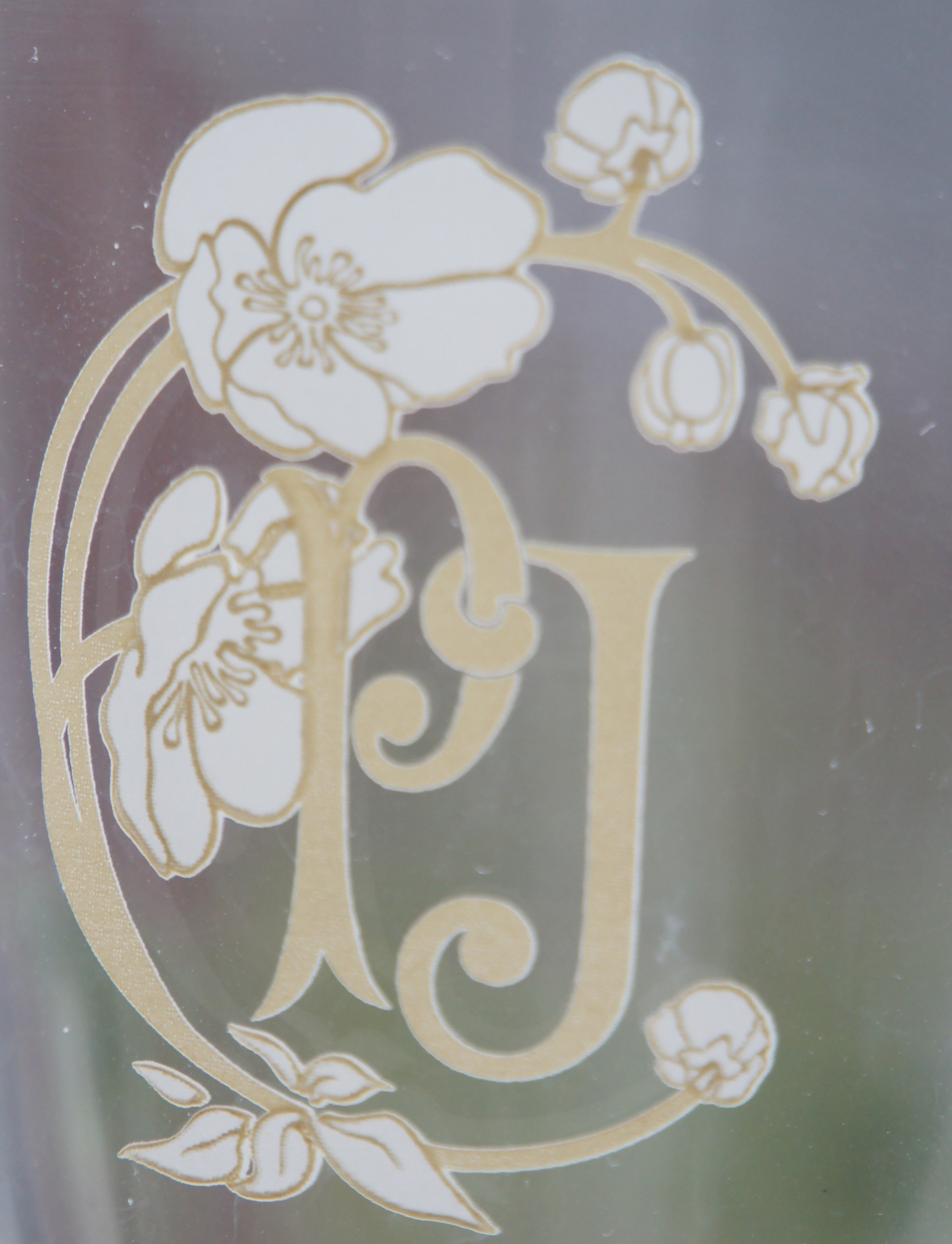
Fig.1. Close-up shot of a Perrier-Jouët special edition champagne flute
Whilst we wanted to retain the actual letters in their gorgeous art nouveau style font, we decided to replace Perrier-Jouët’s trademark anemones with the outline of the hydrangea petals and beech leaves which I had chosen for my wedding bouquet.
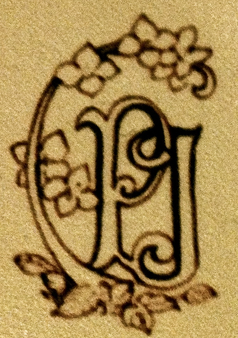
Fig.2. Our P&J monogram
At this point I must express grateful thanks to our friend, professional artist Jan Wild, without whom our P&J monogram would have remained little more than a pipe dream. For Jan was able to take our ideas and skilfully transform them into the motif that was to pervade A Warwickshire Wedding like the word ‘Blackpool’ through a stick of rock.
Initially, I assumed that application of our monogram would be reserved solely for use by Piccolo, the Scottish printers and letter press experts who showed such professionalism and patience (Zoe Armes, if you are reading this, you deserve a gold medal) in working with me to design and create all of A Warwickshire Wedding’s invitations, orders of service and menu cards.
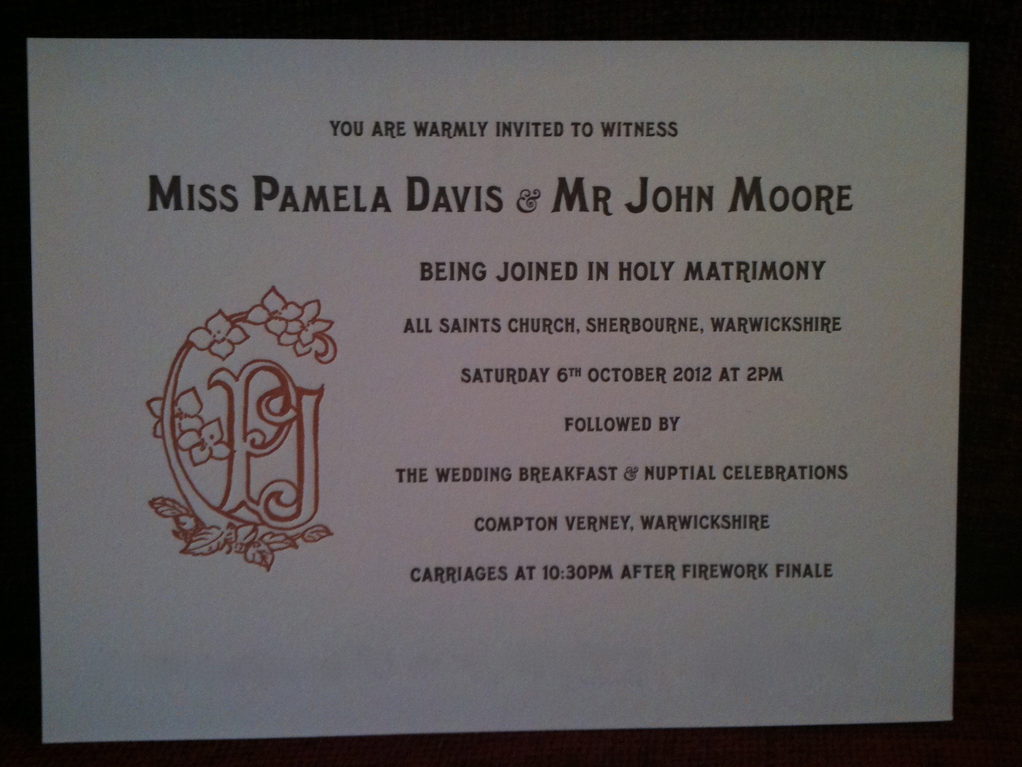
Fig.3.Letterpress invitation by Piccolo Press.
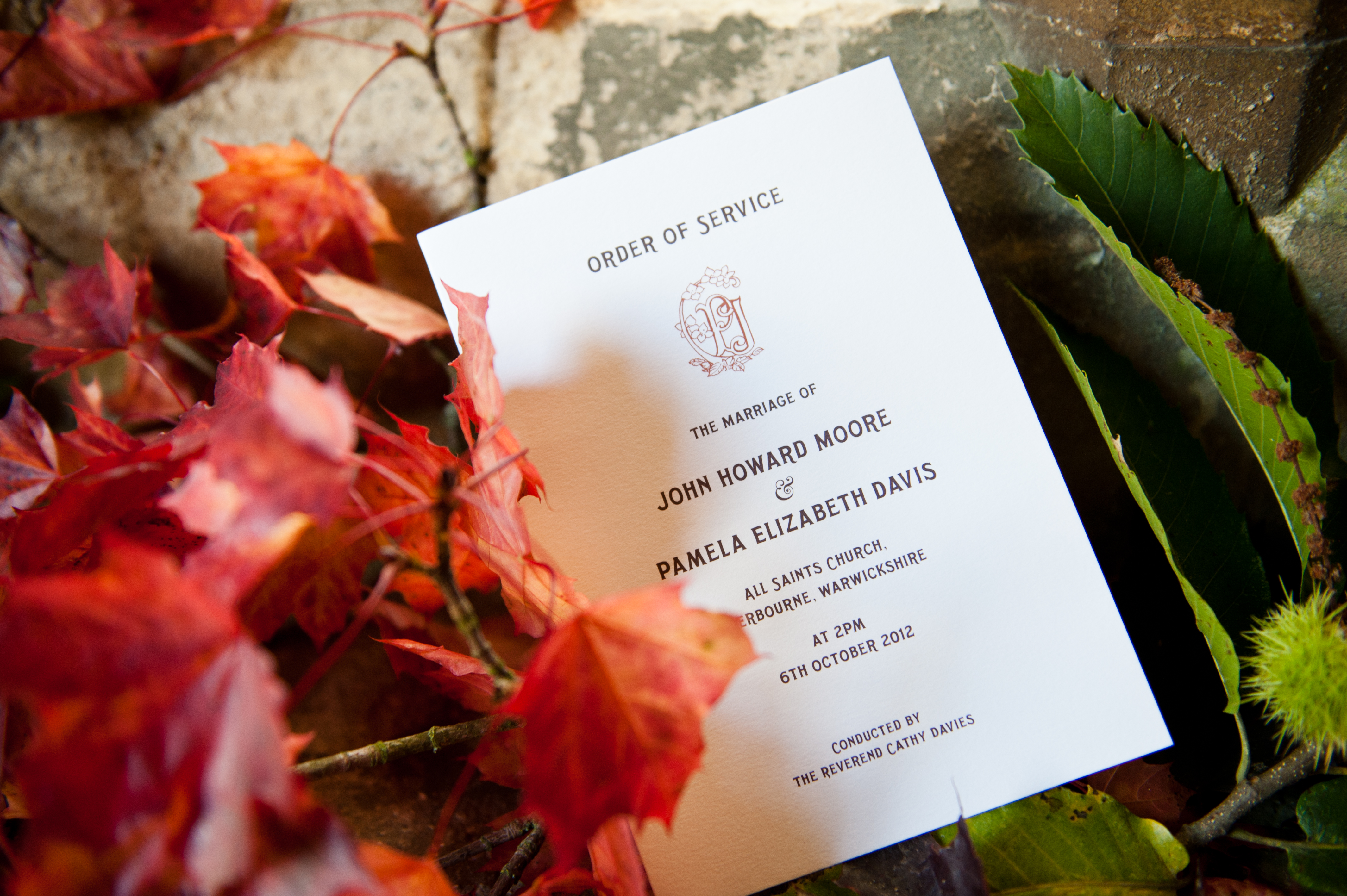
Fig.4. The Order of Service by Piccolo Press. Copyright Tony Rabin Photography
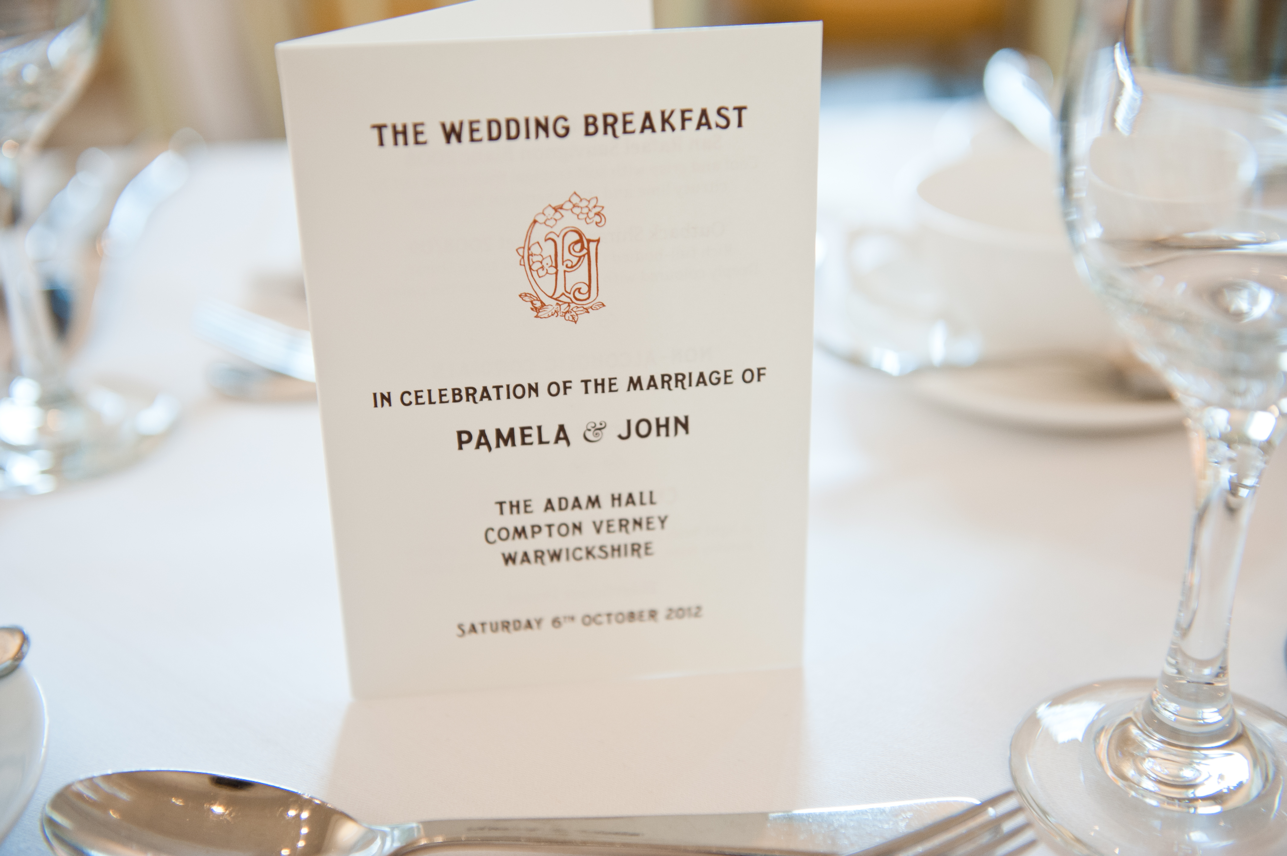
Fig.5. Our wedding breakfast menu by Piccolo Press. Copyright Tony Rabin Photography
But once I got going with the whole P&J thing there was, as you will see from the photographic evidence below, just no stopping me – opportunities seemed to spring up everywhere. It was what H2B jokingly referred to as ‘The Warwickshire Wedding branding exercise’.
The weeks and months that followed saw our monogram recreated in royal icing by Ben the Cake Man to form our wedding cake topper:

Fig.6. Our wedding cake topper. Copyright Tony Rabin Photography.
Made into a rubber ink stamp by the multi-talented Holly-Anne Rolfe, which we painstakingly used to hand stamp P&J on the reverse of each and every wedding invitation envelope and wedding cake box:
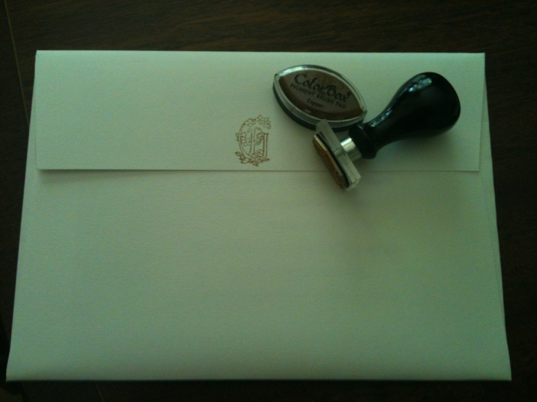
Fig.7. The P&J stamp, created by Holly-Anne Rolfe.
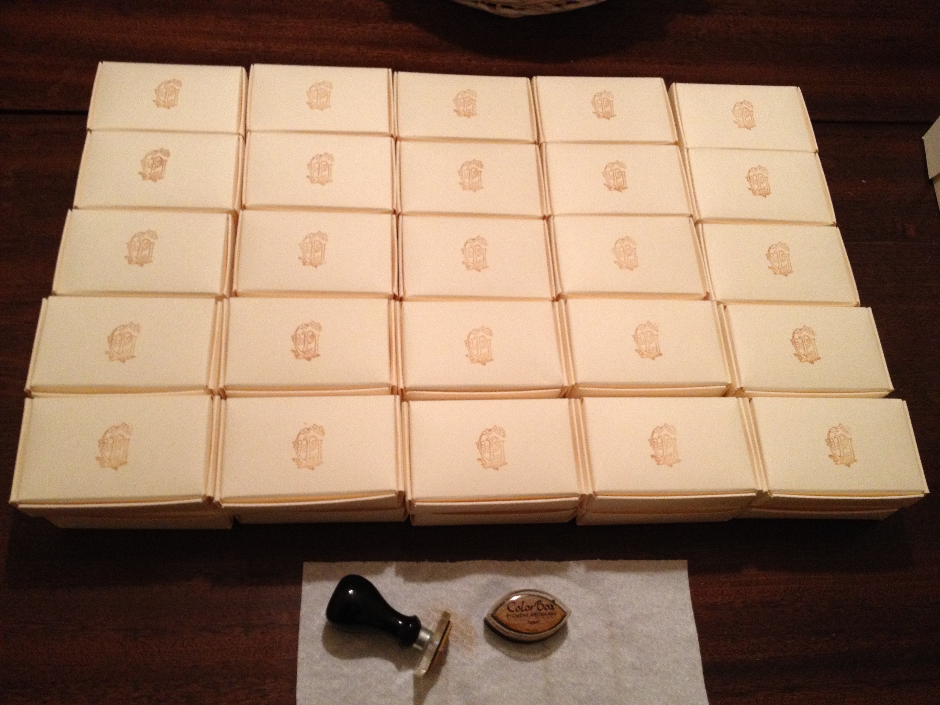
Fig.8. Our wedding cake boxes, each one ‘branded’!
Transferred onto rice paper by Sarah Clemson, KoTD’s friend, to decorate my hen-night cup-cakes:

Fig.9. Mrs Moore-to-be’s Hen Night cupcakes.
Crafted in rose gold by Birmingham based Piccadilly Jewellers to form H2B’s cravat pin as well as being engraved on his watch and cufflinks:
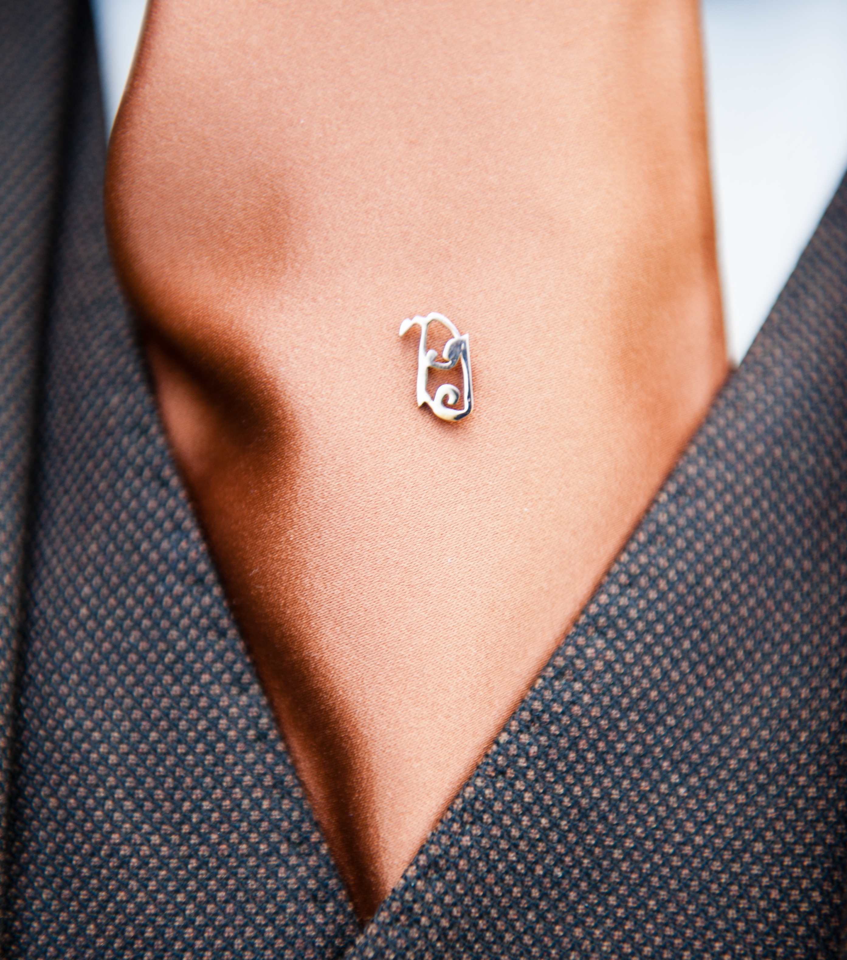
Fig.10. Rose gold cravat pin. Copyright Tony Rabin Photography.
Incorporated in the design of Ruth Moore’s gorgeous evening cup-cake toppers:
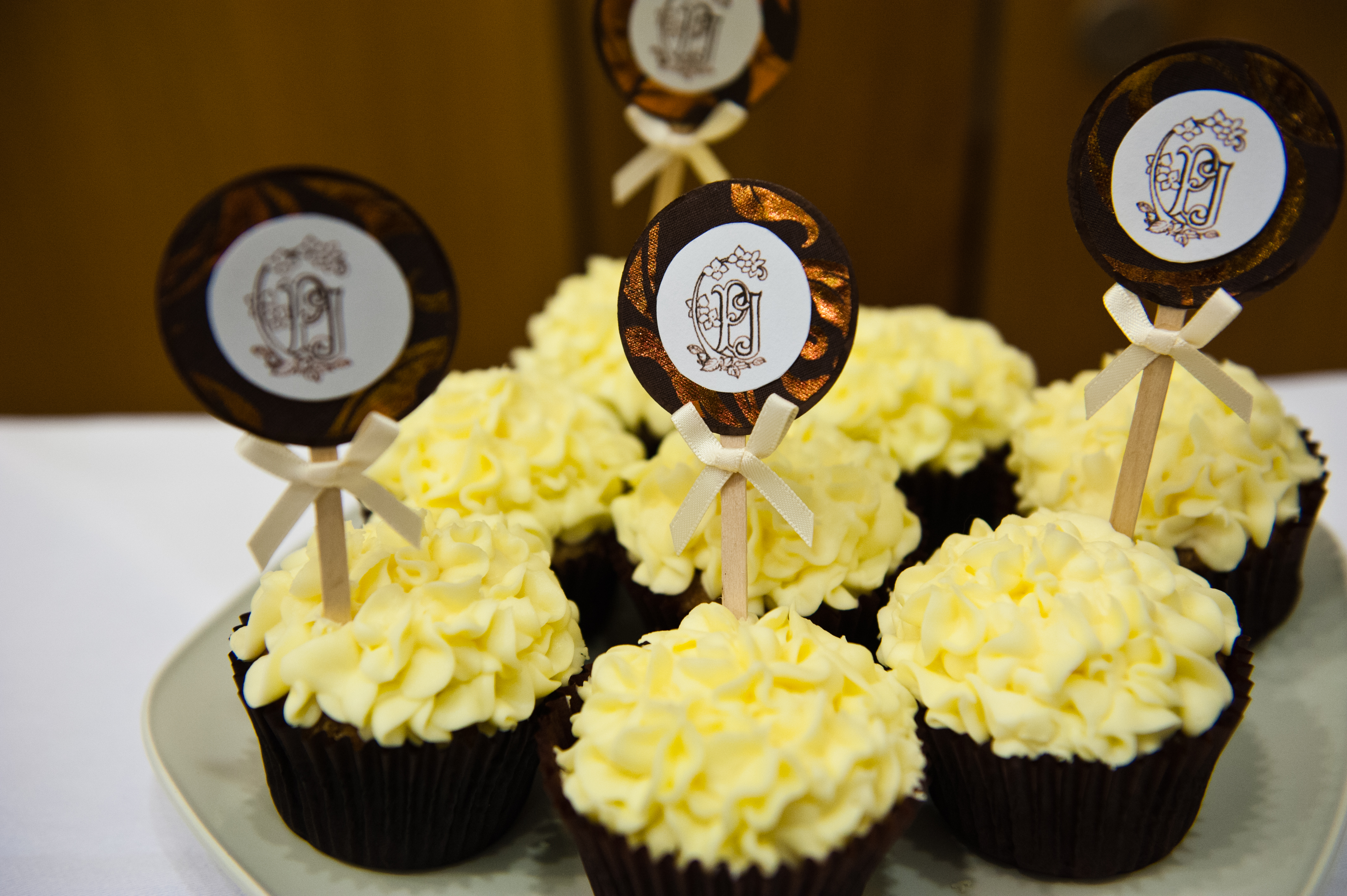
Fig.11. Wedding Day Cupcakes by Ruth Moore. Copyright Tony Rabin Photography.
And even printed by Mrs BeeKnit on to the lining of my wedding bag:
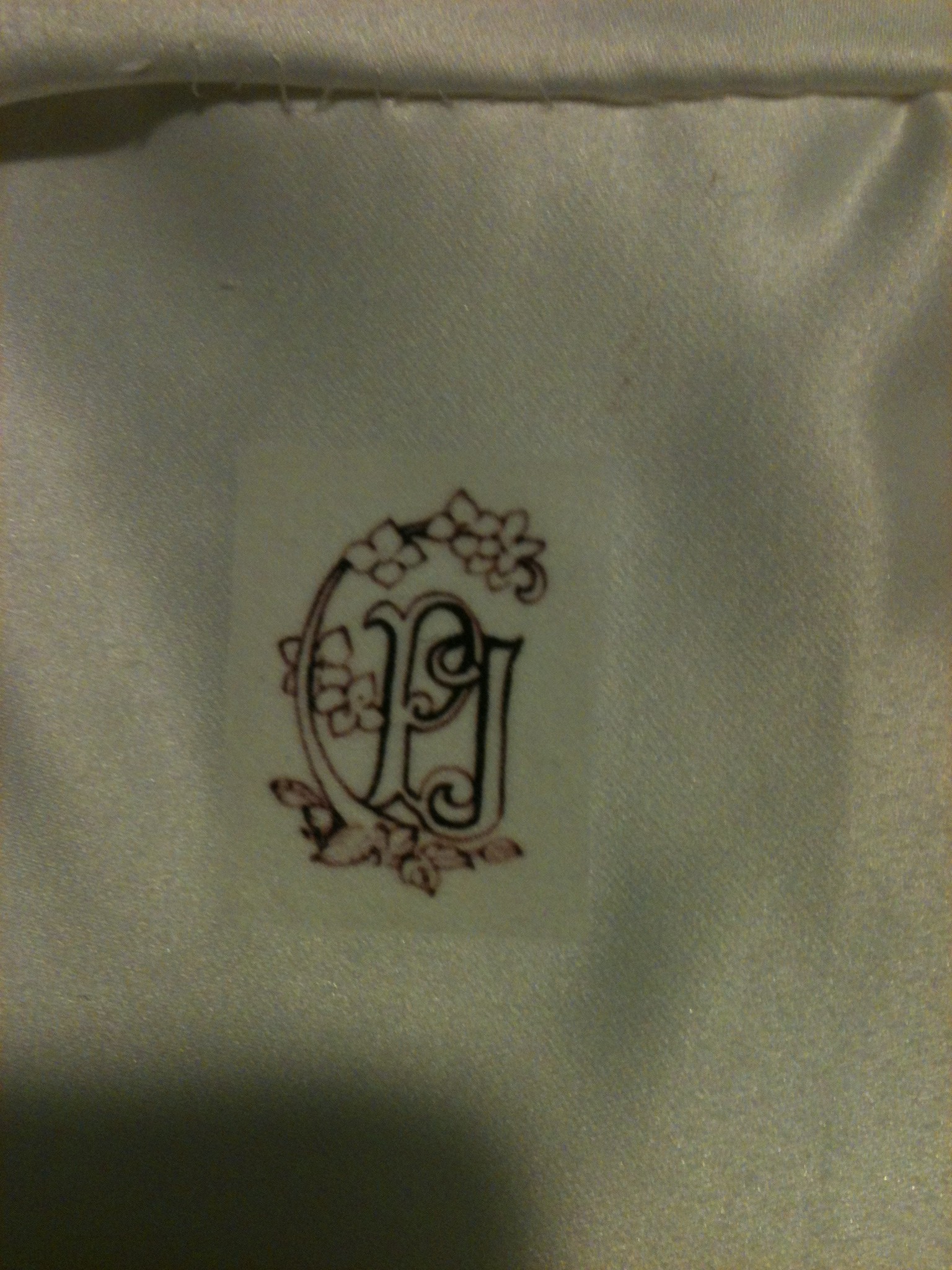
Fig.12. The lining of the wedding bag which Mrs Beeknit made.
And, lest you should fear that I might be suffering from withdrawal symptoms now that our wedding day has passed, let me reassure you that the fun continues. For we are currently in discussion with our wonderful wedding photographer and friend, Tony Rabin, about having a die cast so that P&J can be incised into the leather cover of our wedding album.
So, dear reader, I’ll leave you with this observation: occasionally there are moments in life when exhibiting behaviour which others might regard as being a tad obsessive can actually provide the spur to an outburst of unprecedented creativity and productivity, not to mention umpteen hours of pleasure – for me at least!
