In the months leading up to The Big Day, I carried it everywhere with me. That dog-eared envelope containing a fabric flower, beech leaf and small swatch of woollen tweedy material. Whilst of absolutely no value or importance to anyone outside the world of A Warwickshire Wedding, they were to me, in my wedding planning mode, key to everything I did because they acted as a sort of Pantone colour chart or, as H2B described it, the ‘Pamtone’ colour chart’.
Before I purchased anything at all for our wedding, I would fish the contents from out of the envelope and try to get as close a colour match as possible. I even consulted a real Pantone colour chart to find out which Pantone reference corresponded to the colour of my flower, leaf and swatch so that I could send the code to those suppliers with whom I was working remotely. Looking back I do wonder whether it was a little OTT to expect Ben the Cake Man to mix the icing for our P&J cake topper in accordance with Pantone Reference 18-1244TC. At that time, when Bridezilla was going at full tilt, it seemed a perfectly reasonable request, but afterwards I did find myself cringing ever so slightly at the memory.
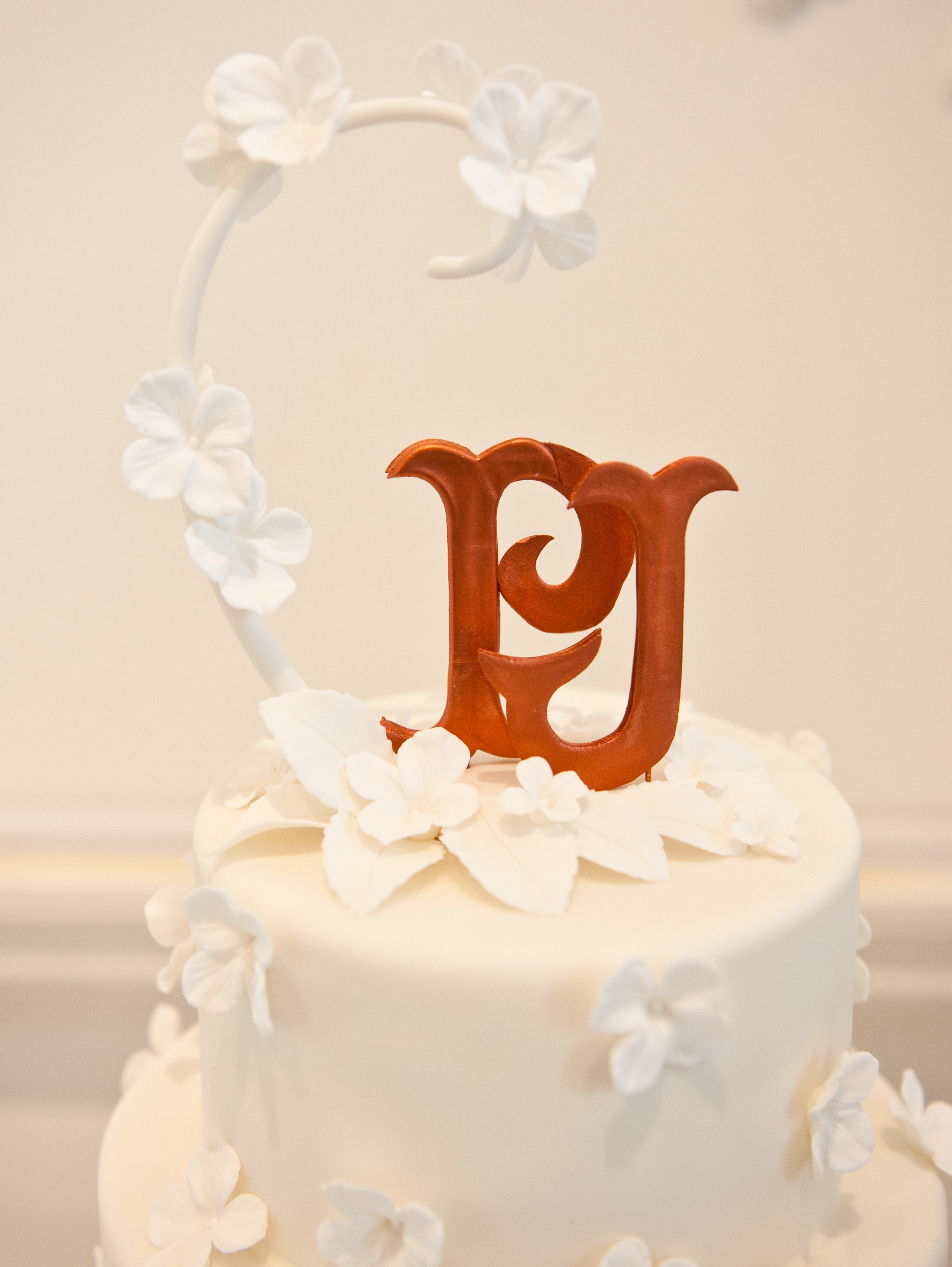
Fig.1. Our coppery coloured P&J monogram crafted by Ben the Cake Man.
Post wedding, in an effort to make light of it, I bought Ben a Pantone colour chart inspired mug, which I hope acted as some sort of compensation for my obsessive behaviour.
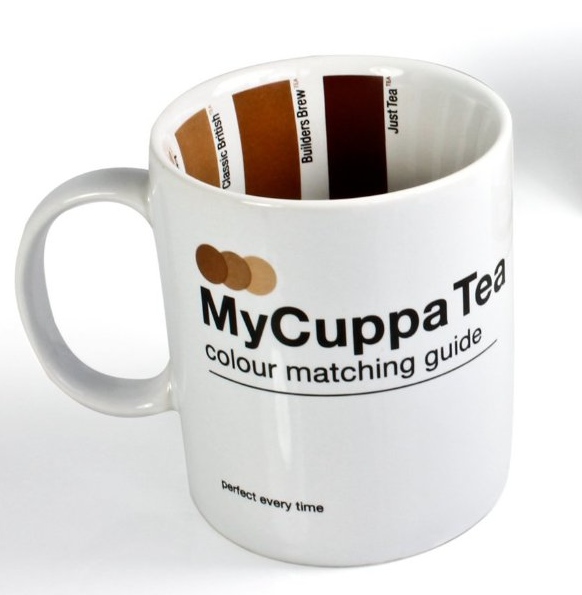
Fig.2. My gift to Ben the Cake Man, available from Suck UK.
Unlike just about everything else connected with A Warwickshire Wedding, when it came to our colour scheme we made a conscious decision to keep it simple and stick to just three colours. The first colour was easy to choose: the ivory of my dress, which was reflected in the colour of our hydrangea floral arrangements.
For our second colour we took our cue from the glorious coppery hue of autumnal Copper Beech leaves. As you can see from the photographs below, combining these leaves with the ivory hydrangea petals made for a beautifully harmonious contrast.
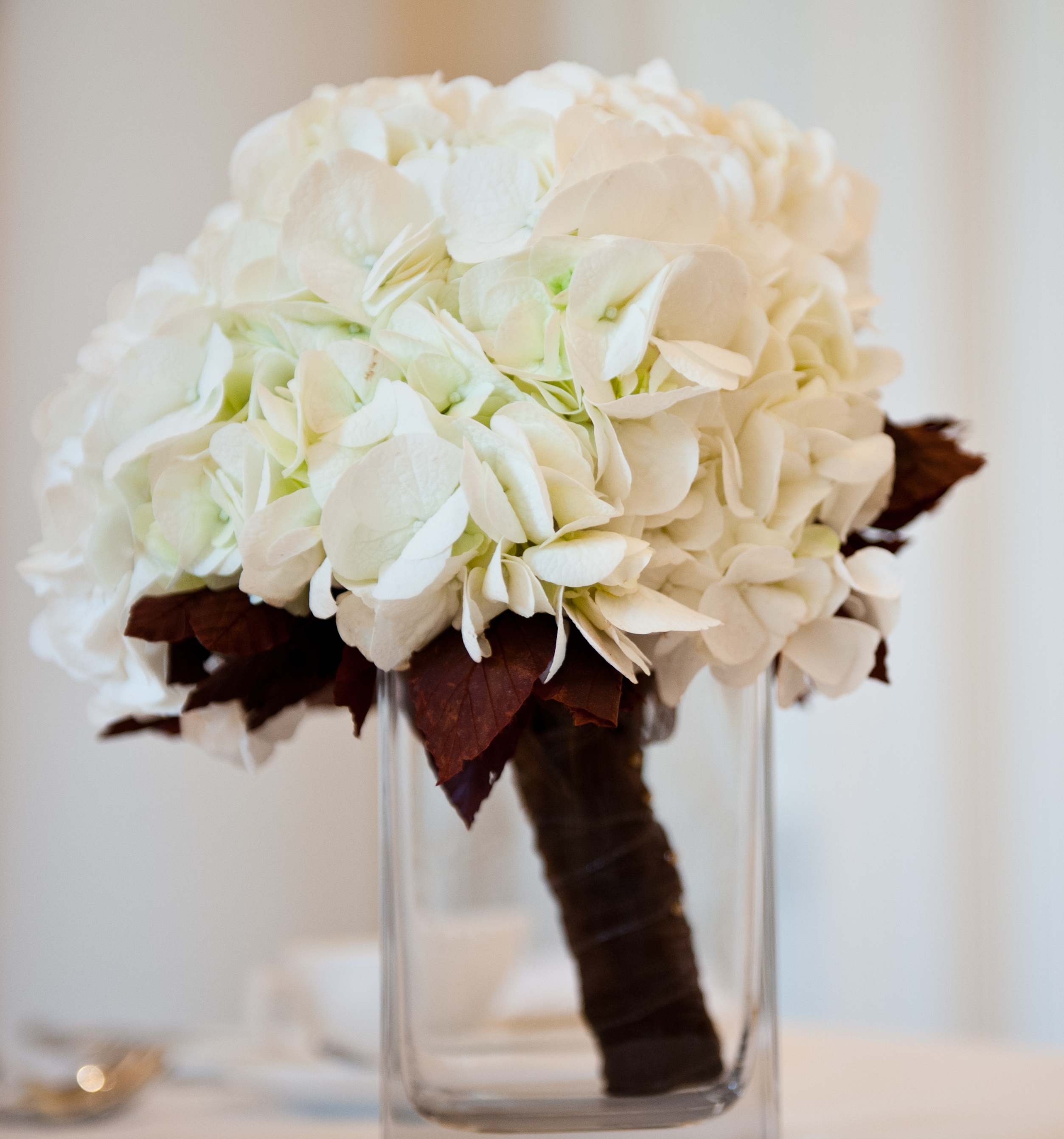
Fig.3. My hydrangea and beech leaf bouquet by Ailsa’s Floral Design.
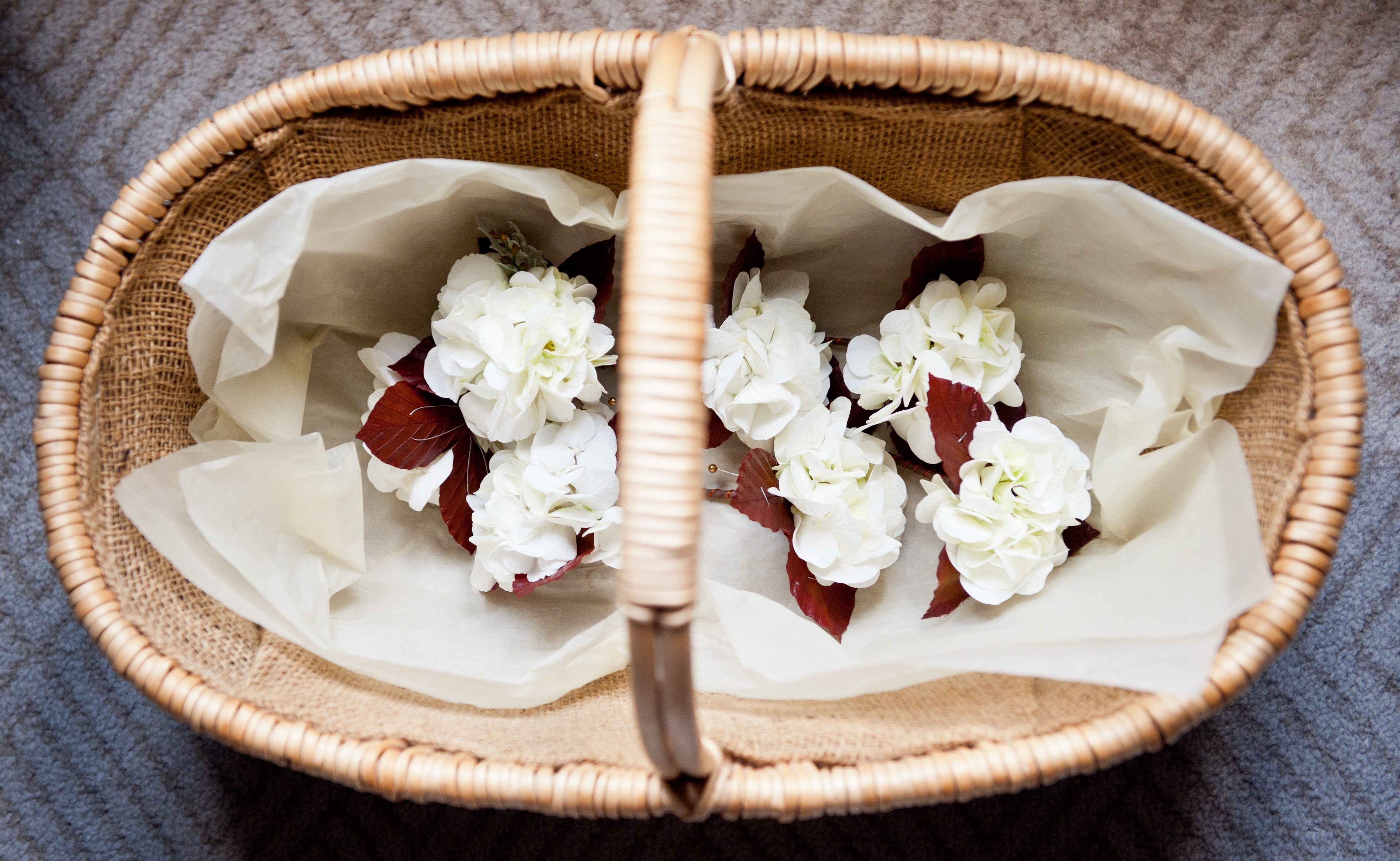
Fig.4. Exquisite button holes, also by Ailsa’s Floral Design.
It was a contrast which I wanted to echo in the colour of our confetti cones which were to contain our ivory hydrangea petal confetti. This apparently tiny detail proved to be one of the toughest retail challenges I faced whilst organising A Warwickshire Wedding. It would have been a piece of cake to find ivory or pastel coloured cones, but darker coloured ones are a rarity. Eventually bespoke confetti cone maker, Rosie of Bespoke Confetti, came to the rescue with a paper imported from India. That might sound a bit extreme, but it really was worth the effort: the cones, made from the most gorgeous textured coppery coloured paper and overflowing with frothy hydrangea petals, were picture perfect on the day.
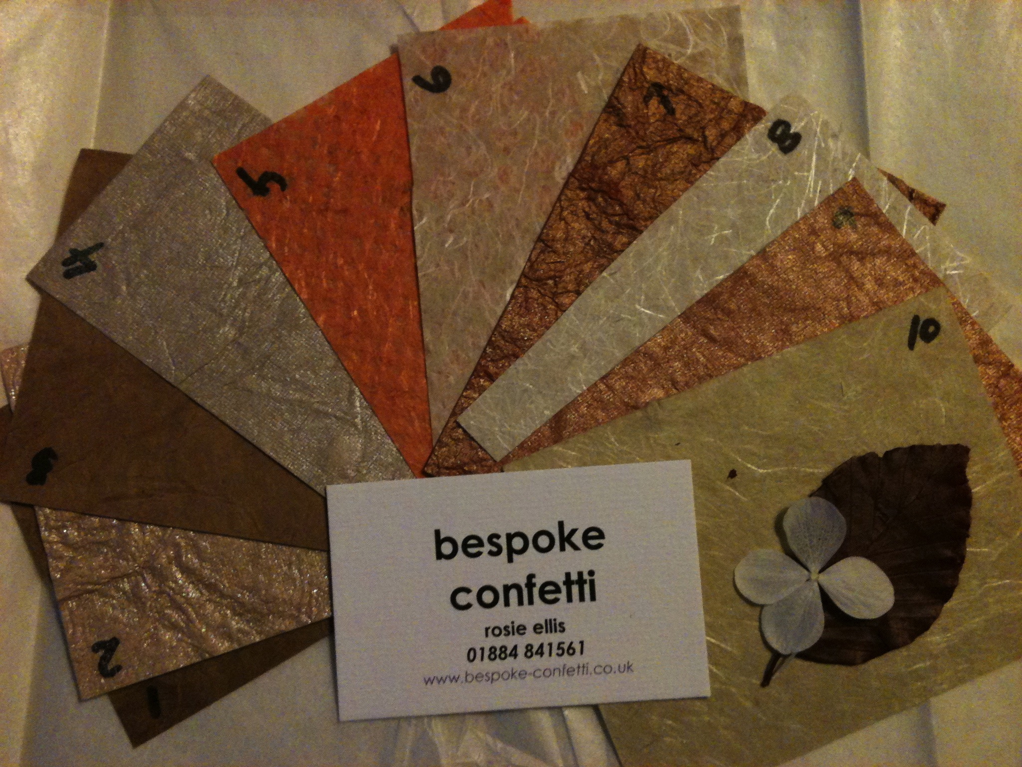
Fig.5. The first stage in my mission to find confetti cones in a ‘Pamtone’ approved shade: deciding between samples from Bespoke Confetti.
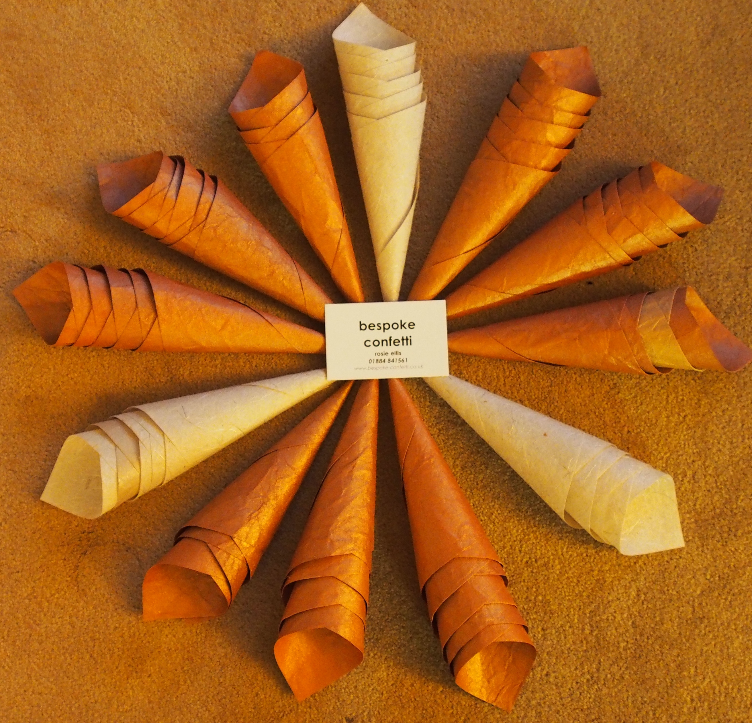
Fig.6. The second stage: receiving the empty cones.
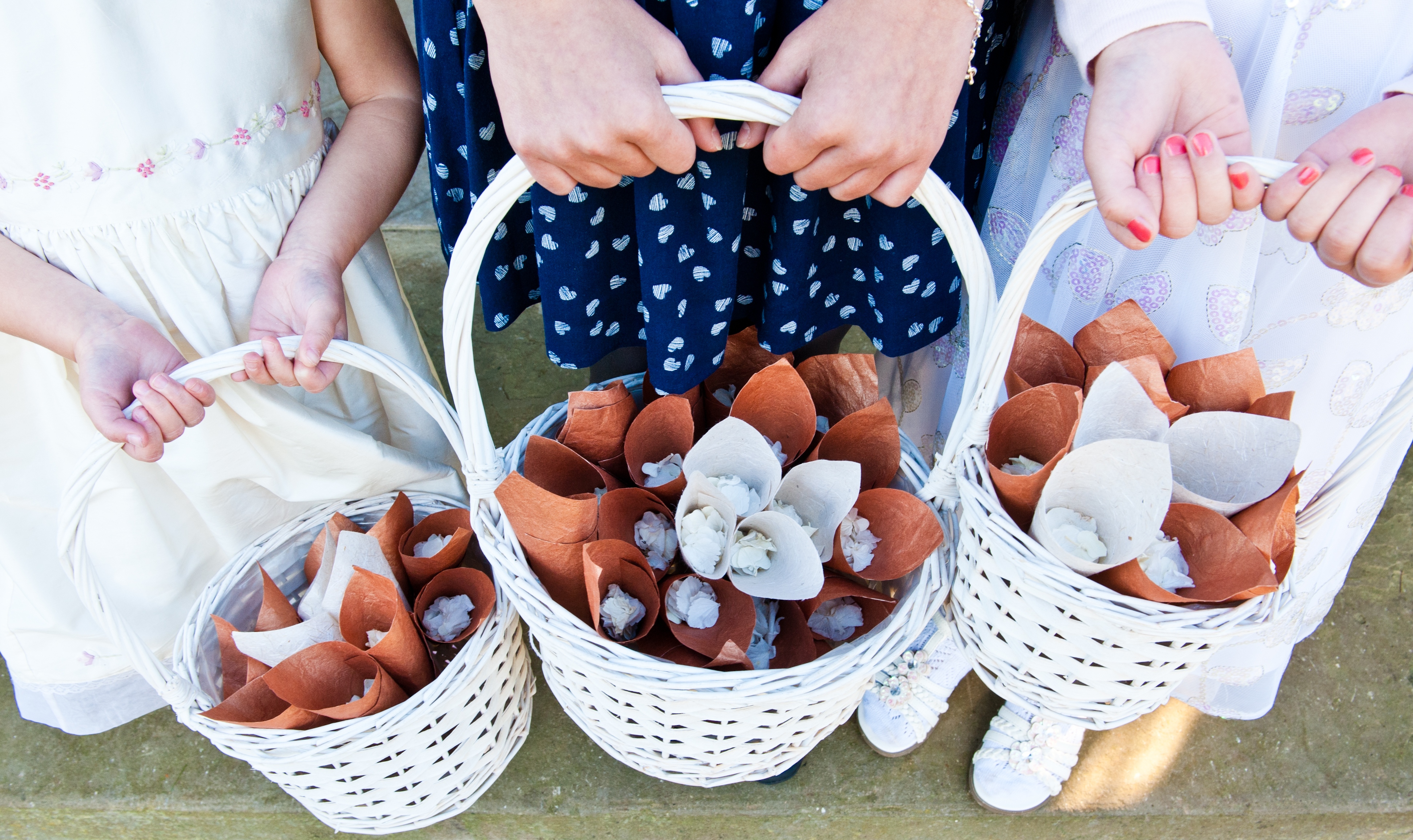
Fig.7. The final stage: filled with hydrangea petals and ready for confetti shot action.
My use of a coppery colour extended well beyond flowers and petals into both the stationery and sartorial spheres: as well as being the colour of the ink used by Piccolo Press for printing our letter pressed P&J monogram on all the wedding stationery, it was also the colour I chose for Charlotte’s Matron of Honour dress and shoes. It had been my intention to buy a pair of ivory satin ballet flats and have them dyed, but to my delight, and quite by chance, I found a pair from Dune in just the right colour leather.
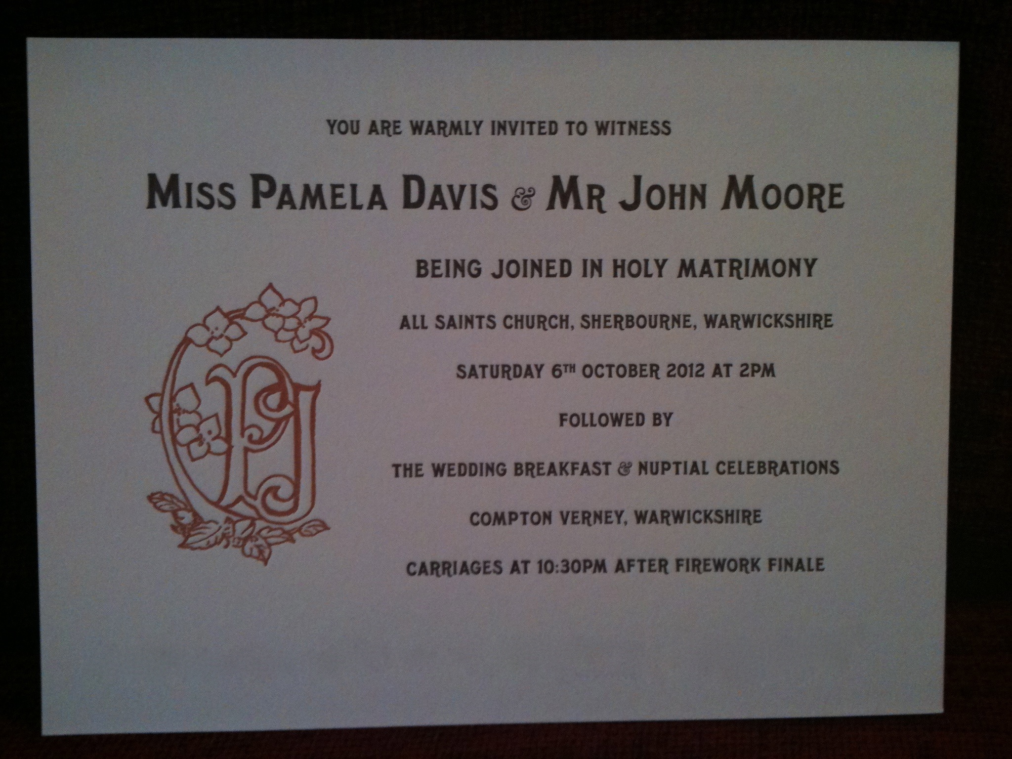
Fig.8. Letterpress invitations from Piccolo Press, with our P&J monogram reproduced in a coppery ink.
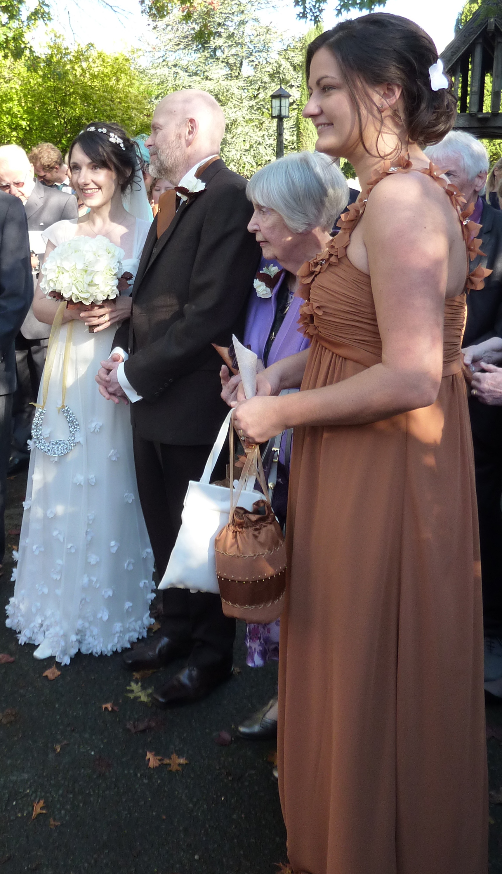
Fig.9. MoH’s dress: exactly the colour of the autumn leaves which surrounded us!
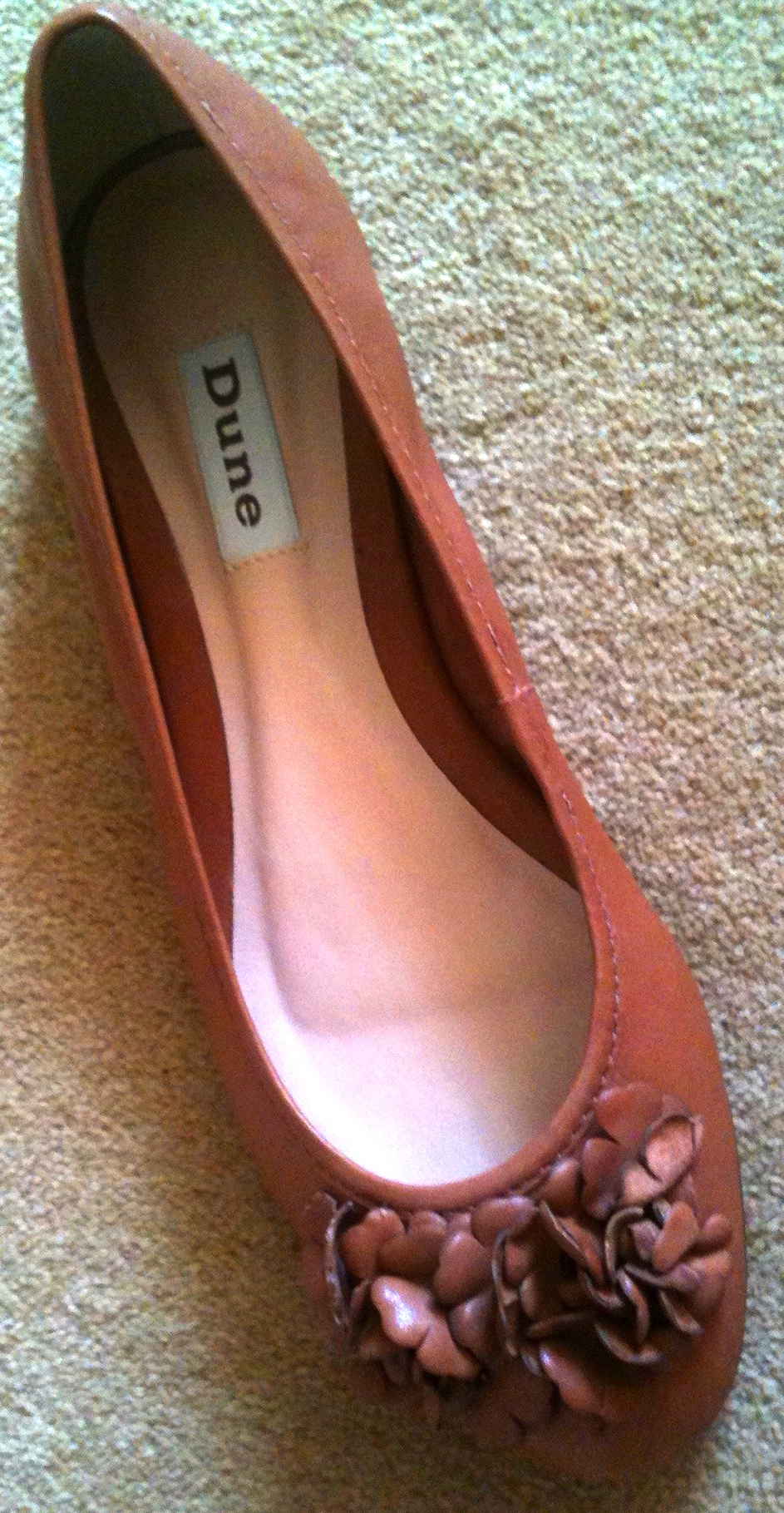
Fig.10. MoH’s matching Dune shoes.
Although primarily made from a lovely soft chiffon, MoH’s dress also included a matching satin trim along the base of the bodice which was just the right sort of material for H2B’s cravat. So when I ordered a length of the satin fabric to be made into a bag for MoH by Mrs BeeKnit, I made sure that I had enough to satisfy Mr Moore’s sartorial needs too.
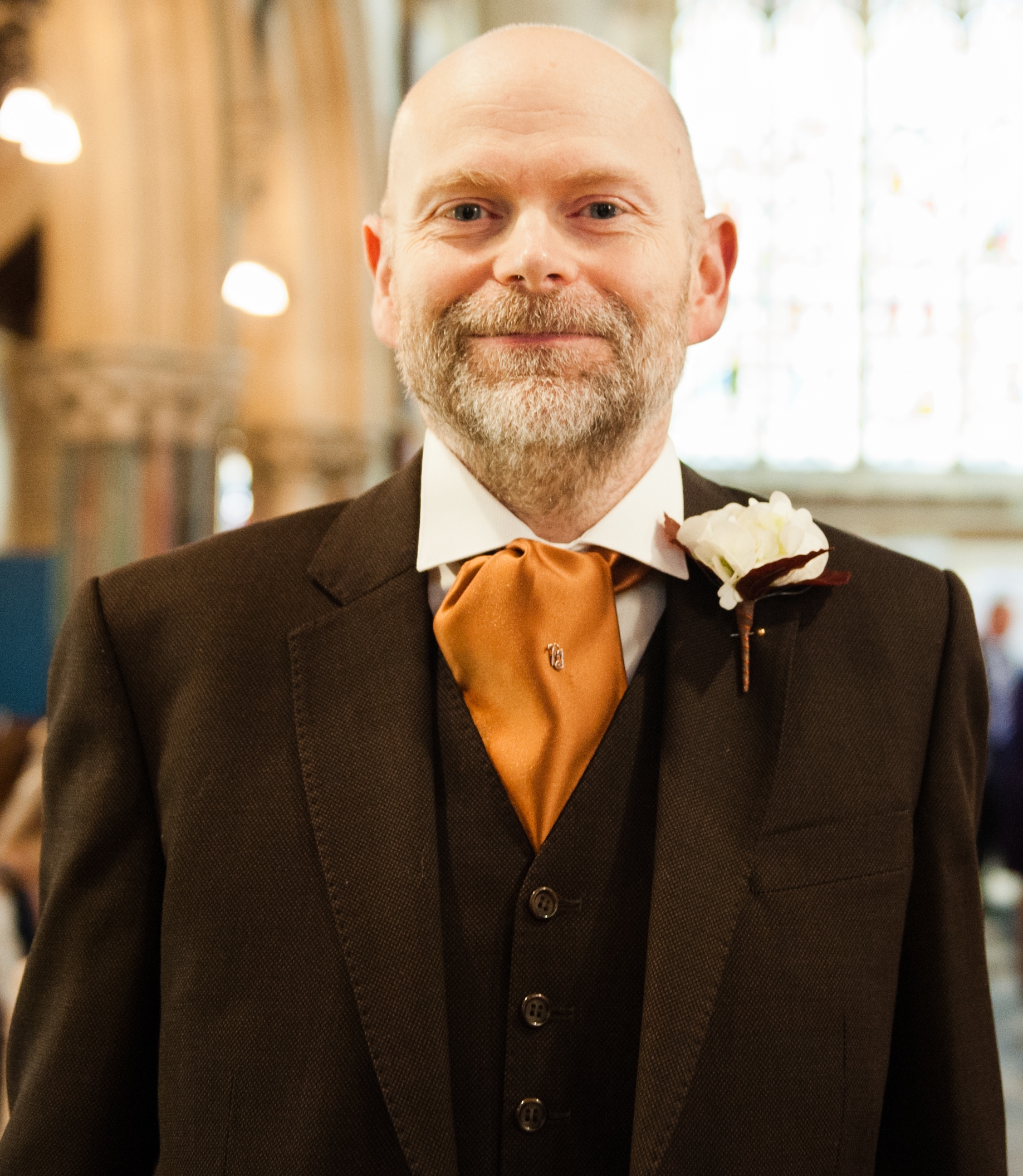
Fig.11. H2B just before he shed the ‘2B’ in his lovely chocolate coloured suit, courtesy of Rosen & Nathan.
For our final colour, we needed to find a shade which would compliment the other two colours and, at the same time, be suitable for H2B’s suit which we were having made by Birmingham based tailors, Rosen & Nathan. Only one colour ticked all the boxes: brown. As you will see from the photograph below, Rosen and Nathan had just the ticket in their sample books: a lovely rich chocolately brown tweedy type woollen fabric with a coppery fleck. It was so perfect that it could have been woven solely for the purposes of A Warwickshire Wedding.
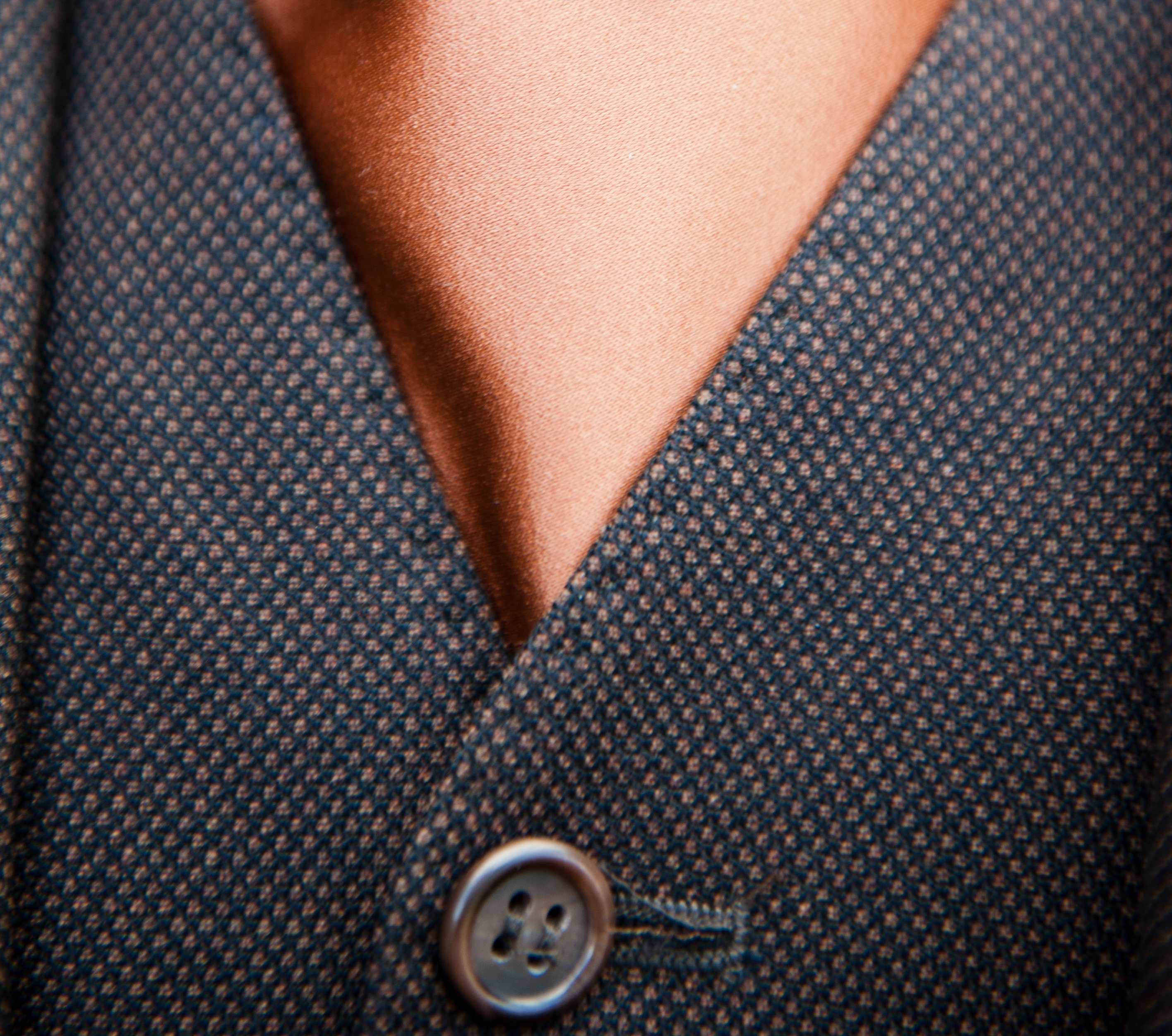
Fig.12. Close up of Mr Moore’s suit. Even though the overall impression was brown, closer inspection reveals that it was in fact a mix of brown woven with a much lighter colour.
So there you have it, A Warwickshire Wedding’s colour scheme. That final element in our thematic triumvirate which, along with our P&J monogram and floral motif, underpinned all our wedding plans and purchasing decisions, even down to our choice of wedding breakfast. I kid you not. For it was no co-incidence that the colour of our carrot and clementine soup starter, sausage and mash main course and sticky toffee pudding and vanilla pod ice-cream dessert bore more than a passing resemblance to our trio of colours. You will, however, be relieved to know that I stopped short of sending our chef the Pamtone colour chart. Embarrassing myself once in front of Ben the Cake Man was bad enough, twice really would have been a step too far, even for a Bridezilla like me.
